As we explore the histogram we will also be exploring a bit into Adobe Photoshop, Bridge, and Lightroom.
The histogram represents every tone in the photo. From black on the left to white on the right.
The vertical peaks represent the number of pixels for each tone.
There is no such thing as the perfect histogram, it depends what you are trying to create.
However, for general picture taking:
-If the histogram extends past the extreme left or right sides, you will lose all detail in black and white, respectively.
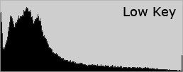
-If the image is relatively dark, the histogram will be weighted toward the left.
-If the image is relatively bright, the histogram will be weighted toward the right.
Let look at the composition of a histogram.
The histogram is divided into 3 main sections, shadows on the far left, midtones in the middle, and highlights at the far right. The histogram below shows the tonal range of a photo in Lightroom.
A histogram is made up of three layers of color that represent the Red, Green, and Blue color channels. Gray appears when all three channels overlap; yellow, magenta, and cyan appear when two of the RGB channels overlap.
Each of these 1 stop ranges contains within it just over 50 discrete brightness levels.
In highkey photos you will see almost every tone at the right highlight side of the histogram. It is a popular misconception that high key is white on white. It's an image that contains very little if any shadows and very little midtone values. Blown out is not high key. You want your tonal values to appear as below without and values hitting the far right
Shadow and highlight clipping can be determined on the histogram of your image.
Clipped areas are either completely white or completely black, and have no image detail.
A quick look at your histogram in camera will let you know it you need to retake your shot. Much better than getting home and finding out.
A histogram also shows the amount of contrast. Contrast is a measure of the difference in brightness between light and dark areas in a scene. Broad histograms reflect a scene with significant contrast, whereas narrow histograms reflect less contrast and may appear flat or dull. Higher contrast images have deeper shadows and more pronounced highlights, creating texture which "pops" out at the viewer.
So why is it important to know how to read a histogram? Because your meter, LCD, and monitor all have the tendency to lie to you.
So you take a photo and you hit the 0 on the meter perfect but your image is too dark, huh…
This reading may have been made because the camera read a variety of areas of the scene and averaged them out, or because you read the highlights, the shadows and some other areas and decided that a particular setting would yield the best compromise exposure for that scene.
If you know how to read the histogram, you can adjust your settings according to the tonal data and get an exposure with a good tonal distribution.
Enter Eeyore! I'd love to have a better subject for you but I've been sick on and off for 2 weeks and I have a fondness for my blue friend here.
Eeyore here was shot in natural light against a bright background(f4.8 @1/45). The camera averaged the scene and determined that this was a 0 exposure on the meter. As you can see in the histogram, the image is underexposed by 1-2 stops. This really isn't what I want. I could try to balance in post processing but you will always yield the best results from in camera. Also, with an underexposed image, you will end up with noise in the deep shadow areas the more you lighten them.
A 1 stop overexposure from the original reading evens out the tonal range and gives a good exposure. You can see at the right that there is
highlight clipping but not in any significant areas.
Have you ever noticed when adjusting levels and curves there is a histogram display? Being able to read a histogram is important in post processing. Understanding it will give you much better control over your PP.


No comments:
Post a Comment